
 Hi again,
 I'm back with another tale about designing the front page of TNH. Last time, we had a great photo to work with for the lead story. Yesterday, we had nothing. Zero. Zilch. Nada. It's not exactly an uncommon problem to not have lead art for the paper, that's a problem that comes with not having many photographers.
Fortunately, we had already known earlier in the week that Kyle Stucker's piece about the open forum on strategic planning and plans to improve the quality of education at UNH would probably be our centerpiece story. While it's not exactly a topic that screams "Graphics!", it doesn't hurt to have ideas stewing in your mind for a couple of days, just in case something better doesn't reveal itself.
In doing some token research of the open forum, I came across a Facebook group dedicated to get students involved in the process called "What's the Best/Worst of UNH? How Do We Make It BETTER?" That group featured a list of nine "working groups" that would help determine the university's overall direction. Essentially, we had nine parts to a whole
It wasn't much, but it was something, so we ran with it, thinking if something better came up we could scrap it and change directions.
The next step was deciding how to display the nine work groups graphically. This was a little tricky because we're dealing with some pretty vague concepts. I knew I wanted something simple, even geometrical if possible. So, after a round of word associations alongside Managing Editor Extraordinaire Nate Batchelder, I came up with the following logos for each of the working groups. I've bolded the words that were especially inspirational.
 Breaking Silos, Scrambling Categories: Integrating the Academy Horizontally and Vertically
 Research: New Frontiers and Old Challenges
My original idea was a sunset, to represent "frontiers". That was shot down.
 Teaching and learning: Modalities, Technology and Contexts in the 21st Century
 Communities and Alliances: Expanding and Deepening UNH's Strategic Partnerships
The original idea here was to have a set of linked chains, but I couldn't figure out for the life of me how to draw that. So we went with a Venn Diagram instead.
 Affordability and Access: Developing a Sustainable and Socially Responsible Business Model for UNH
 Sustainability: Extending the UNH Commitment
Yeah, yeah. I know sustainability isn't just about recycling. But I think it works better symbolically than a lightbulb or a tree. You'll see in a moment another reason I didn't want to use a tree.
 STUDENT EXPERIENCE: UNH As A Student-Centered Institution
Drawing concentric circles is deceptively difficult. I wish I had spent a little more time on this one. We also thought about drawing a graduation cap or a diploma, but this was simpler and faster to draw.
 New Markets: Generating Resources to Meet Core Missions
 UNH and the World: Advancing a Global Perspective
This is the symbol that got the most "what's that supposed to be?" questions. I was going for the look of longitude-latitude lines/Captain Planet's chest logo, but I didn't bother checking what those things actually looked like. The execution could have been better, if I had taken some lines out and added some curves. However, I still like this idea better than trying to trace the continents using the pen tool.
The branches were really the important part, because they needed to be thick enough and wide enough apart for the symbols to be "hung" on them.
Using Illustrator, I traced over the family tree using the brush tool. I was my first extensive experience with the tool, and I was pretty pleased with the results. I'm glad the computer program smoothed out my lines, but still left them looking organic.

This what the tree drawing looked like using the normal brush tool.

I liked it, but it looked flat. So I messed around with Illustrator some more and found the option to change the type of brush I used. I liked the look of the felt tip marker option the best, so one click and....SHAZAM!

Now that's a good looking tree (though maybe a little dead looking, we'll say that was a metaphor).

I didn't start building this graphic until about 8:30 p.m. and finished a little before midnight. It would have gone faster if I hadn't been called away a couple times and if I was more comfortable with Illustrator.
I think the end result was pretty good. If I had to go back, I would have spent more time on the logos, since I wasn't happy with the final look of a few of them. I would have adjusted the placement of some of the logos (The bullseye was just a little bit too high).
I would not, however, have added labels to the logos. I think the graphic says enough by itself (specifically, that UNH, the tree, has many focuses, the branches, that they are trying to grow) without having to add a bunch of words.
Here's the PDF of the final page with all the stories on it. Nate Batchelder did the everything else on the page, and, of course, Kyle Stucker wrote the article that I had to work with.
Here endeth the lesson,
John "The Lame Duck" Ferguson
Total time on project: About 3 hours
Programs used: Illustrator, InDesign
In doing some token research of the open forum, I came across a Facebook group dedicated to get students involved in the process called "What's the Best/Worst of UNH? How Do We Make It BETTER?" That group featured a list of nine "working groups" that would help determine the university's overall direction. Essentially, we had nine parts to a whole
It wasn't much, but it was something, so we ran with it, thinking if something better came up we could scrap it and change directions.
The next step was deciding how to display the nine work groups graphically. This was a little tricky because we're dealing with some pretty vague concepts. I knew I wanted something simple, even geometrical if possible. So, after a round of word associations alongside Managing Editor Extraordinaire Nate Batchelder, I came up with the following logos for each of the working groups. I've bolded the words that were especially inspirational.
 Breaking Silos, Scrambling Categories: Integrating the Academy Horizontally and Vertically
 Research: New Frontiers and Old Challenges
My original idea was a sunset, to represent "frontiers". That was shot down.
 Teaching and learning: Modalities, Technology and Contexts in the 21st Century
 Communities and Alliances: Expanding and Deepening UNH's Strategic Partnerships
The original idea here was to have a set of linked chains, but I couldn't figure out for the life of me how to draw that. So we went with a Venn Diagram instead.
 Affordability and Access: Developing a Sustainable and Socially Responsible Business Model for UNH
 Sustainability: Extending the UNH Commitment
Yeah, yeah. I know sustainability isn't just about recycling. But I think it works better symbolically than a lightbulb or a tree. You'll see in a moment another reason I didn't want to use a tree.
 STUDENT EXPERIENCE: UNH As A Student-Centered Institution
Drawing concentric circles is deceptively difficult. I wish I had spent a little more time on this one. We also thought about drawing a graduation cap or a diploma, but this was simpler and faster to draw.
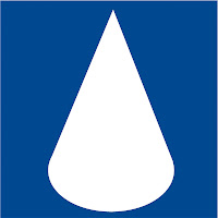
 New Markets: Generating Resources to Meet Core Missions
Another case where I was starting to feel the time crunch. This is supposed to be a drop of water (or oil). Something is off about the bump on the bottom and the slope of the sides.
I also don't think the working group is talking about natural resources, but financial ones.
I also don't think the working group is talking about natural resources, but financial ones.
 UNH and the World: Advancing a Global Perspective
This is the symbol that got the most "what's that supposed to be?" questions. I was going for the look of longitude-latitude lines/Captain Planet's chest logo, but I didn't bother checking what those things actually looked like. The execution could have been better, if I had taken some lines out and added some curves. However, I still like this idea better than trying to trace the continents using the pen tool.
The logos were only a part of this project however. The other idea that Kyle had touched on when talking about this story was an idea about UNH changing, growing, or heading down a new path. I chose to run with the growing idea and make the largest part of the centerpiece a tree, with branches extending to each of the different icons. (I also considered a path/road motif, but I didn't like the initial sketches I made for that so dropped it)
Of course, I had knew I wasn't going to be able to find the exact clipart of the tree I wanted, and I didn't want a tacky looking Photoshop either. Again, I wanted something simple and clean with a decent amount of air around it to break up the gray that was going to be all over the rest of the page.
I was going to need to draw a tree in order to get what I want. And since I don't have the time, skill or technology to do something freehand, I went back to what worked in middle school, tracing.
As I finished touch-ups on the logos, I tasked editorial assistant (and future Design Editor) Christine Hawkins with finding an image of a tree that I wanted to use, based only off the descriptions like "post-modern truck" and "like the Lion King tree, but less leafy". After bickering over about two dozen different examples (too many branches, the trunks too skinny, etc.), she finally brought me this image from a family tree website.

The branches were really the important part, because they needed to be thick enough and wide enough apart for the symbols to be "hung" on them.
Using Illustrator, I traced over the family tree using the brush tool. I was my first extensive experience with the tool, and I was pretty pleased with the results. I'm glad the computer program smoothed out my lines, but still left them looking organic.

This what the tree drawing looked like using the normal brush tool.
I liked it, but it looked flat. So I messed around with Illustrator some more and found the option to change the type of brush I used. I liked the look of the felt tip marker option the best, so one click and....SHAZAM!
Now that's a good looking tree (though maybe a little dead looking, we'll say that was a metaphor).
While I had been working on the tree and logos, Nate had been working on the front page, leaving the centerpiece space open for when I was good to go.
I dropped the drawing on the page and manipulated it increasing the height and decreasing the width just a little. I dropped the symbols into equal sized picture frames with rounded edges and an embossed effect. I decreased the tint of tree, because leaving it straight black would have made it too intense and I wanted layer the headline on top of the graphic.
The headline is Century Old Style. I messed with the vertical spacing to make it all come together nicely (notice how the question mark comes up into the line above it.) And that's about it.
I didn't start building this graphic until about 8:30 p.m. and finished a little before midnight. It would have gone faster if I hadn't been called away a couple times and if I was more comfortable with Illustrator.
I think the end result was pretty good. If I had to go back, I would have spent more time on the logos, since I wasn't happy with the final look of a few of them. I would have adjusted the placement of some of the logos (The bullseye was just a little bit too high).
I would not, however, have added labels to the logos. I think the graphic says enough by itself (specifically, that UNH, the tree, has many focuses, the branches, that they are trying to grow) without having to add a bunch of words.
Here's the PDF of the final page with all the stories on it. Nate Batchelder did the everything else on the page, and, of course, Kyle Stucker wrote the article that I had to work with.
Here endeth the lesson,
John "The Lame Duck" Ferguson
Total time on project: About 3 hours
Programs used: Illustrator, InDesign


No comments:
Post a Comment